Friday 25 November 2016

Home Page

Hello! Here is my profile and links to my Creative and Digital Media Apprenticeship units and online portfolio:

NAME: Laura Jade Slack

BIRTHDAY: 3rd February 1992

FAVOURITE COLOURS: Blue, green, teal (Cornwall colours!) But I pretty much like all colours

FAVOURITE MUSIC: A bit of everything! My shuffle can go from Trap to Drum & Bass to Classical etc. It's crazy!

SIBLINGS: Older brother (James)

LOVES: Family, friends, Poldark, Cornwall, Writing, Arts and crafts, being creative, cats, naps, cushions, silky things, gin, being happy!


HATES: People who judge me before they get to know me, people who try to change me, favouritism, people who walk slow (Trust me, I'm from Chesterfield!)

STARSIGN: Aquarius

FAVOURITE FILM: Zorro, Disney films, Shrek, Studio Ghibli, classics from the 80s/ 90s


FAVOURITE TV SHOW: Poldark 💓


FAVOURITE GAME: The Sims


FAVOURITE BOOKS: Poldark, His Dark Materials and childhood classics like Enid Blyton's Famous Five, Malory Towers etc. and 101 Dalmatians

FAVOURITE CELEBRITY: Aidan Turner 😍

FAVOURITE FOOD & DRINK: Can't decide on food, but I drool when I see cold smoked salmon and cheese is a weakness! For drink, a nice citrusy gin and lemonade or tonic!

FAVOURITE ANIMALS: Cats 🐱


Tuesday 22 November 2016

Unit 37 - Agree the Photo Imaging Brief

(37.1) Be able to use information relevant to the photo imaging brief to generate ideas

1.1 Identify client requirements relating to photographic content deliverables

When working on a photographic assignment for Lea Green, an outdoor activity centre for young people over the Spring and Summer, we attended a meeting to find out exactly what the client wanted. They wanted us to capture the happiness and enthusiasm of young people participating in various activities. We needed to find out where the workshops would be taking place and when. Some were inside and others outside, so we needed to consider if we’d need any lighting or which settings we’d have to change.


1.2 Identify any hazards and risks relevant to the photo imaging brief

https://lauracreativeanddigital.blogspot.co.uk/2016/05/unit-40-plan-and-organise-photographic.html

(See Unit 40 - (40.5) Above)

1.3 Identify capabilities and limitations of own business or organisation’s resources in relation to the clients’ requirements/
1.4 Use the information gathered to generate ideas for the proposed work

Generally we didn’t have any restriction as we had everything we needed. Myself and my colleague took two Canon DSLRs, the 650d and 760d. We also took a tripod because they wanted us to also film a few of the young people saying to the camera what their favourite school dinner was. Beforehand we ensured the batteries were all charged and that we had the correct lenses. As mentioned in Unit 40 and 41, the main worry for us was the weather. If it had rained heavily, a lot of the outdoor activities may have been cancelled. Or even the full event may have had to have been cancelled and rescheduled to another date that might not necessarily have been suitable for us at DCAS.


On the day of arrival, we got the cameras set up and acquired a timetable of the workshops so we knew what was happening and where. We decided to get the indoor shots first so we wouldn’t be switching camera settings about too often. It was dark inside so we had to adjust a lot of settings. We didn’t have the iso too high so as to avoid the image being too grainy. A lot of the workshops were very different. For example some were more relaxed and calm whereas others were more active. Again, outside it was a bright day so we had to bring the iso way down. A lot of the young people were running really fast so we decided it would be easier to work in autofocus mode. We decided that we wanted to get more closeups to show the happiness in their faces, and also some closeups of any items they were using for more artistic shots. We went round all the workshops a few times to ensure we’d got as many shots as possible.

(37.2) Be able to liaise with clients regarding the photo imaging brief

2.1 Negotiate and agree with clients the purpose, deadline, budget/
2.2 Present selected approach clearly to clients/
2.3 Agree the contract for services with clients/
2.4 Inform clients of intellectual property and copyright policy/
2.5 Maintain a professional manner when dealing with clients

Please see:


https://lauracreativeanddigital.blogspot.co.uk/2016/07/unit-41-undertake-photographic.html

(37.3) Be able to evaluate performance in relation to the photo imaging brief

3.1 Reflect on your own work, identifying any potential improvements/
3.2 Identify relevant sources of information to update knowledge and skills relevant to own work

Being quite new to Photography with a DSLR camera, I was quite impressed at the images I’d managed to capture. Obviously due to the nature of what we were photographing, some of our pictures had blurred because of the speed of the children. However, we’d taken many images and we managed to narrow them down to the ones we like. There were even ones where when we took them we didn’t think they were going to turn out well, but ended up looking really good. It’s amazing how you can sometimes get a really good shot without even realising you got it.

I’ve recently bought myself a Canon 650d for my vlogging and to take pictures on when the weather improves. I’ve grown really used to it and keep experimenting with settings in my own time. My house is quite dark so this can sometimes prove challenging. I also bought a ring light which fixes on the end of the lens which is really cool and brightens things up a bit. The more I practice, the more I can improve for future jobs and assignments.


(37.4) Understand legal and regulatory requirements which impact on the photo imaging

4.1 Identify key aspects of legislation relevant to the photo imaging brief/
4.2 Explain requirements for personal and professional identification in photo imaging assignments

(Please see (41.4) in Unit 41)

Monday 7 November 2016

Unit 18 - Digital Communication

(18.1) Understand digital communication systems

1.1 describe protocols, devices and methods used in digital communication systems with some appropriate use of subject terminology
In the world we live in today, there are many ways of contacting people and many devices to use, whether it be telephoning, texting or talking online.


When it comes to protocol, it depends on who you are contacting and what it is regarding. If emailing a client professionally, you wouldn’t address them as you would your best mate on Facebook! Here are a few examples of devices/ systems and the different circumstances of using them:

HTTP (Hyper Text Transfer Protocol):

HTTP is the foundation of data communication for the World Wide Web. Hyper text is structured text that uses logical links between nodes containing text. HTTP is the protocol to exchange or transfer hyper text.

CSS (Cascading Style Sheets):

CSS describes how HTML elements are to be displayed on screen, paper, or in other media. CSS saves a lot of work. It can control the layout of multiple web pages all at once. External stylesheets are stored in CSS files.

WAP (Wireless Application Protocol):

This is a way of accessing information over a mobile wireless network. A WAP browser is a web browser for mobile devices. Now WAP use isn't as common as most handset internet browsers now support full HTML.

GSM (Global System for Mobile):

This was developed by the European Telecommunications Standard Institute to describe protocols for second generation digital cellular networks used by phones. This was a replacement for first generation analog cellular networks.

3G (3rd Generation protocol):

This is the third generation of mobile telecommunications technology. It's based on a set of standards used by mobile devices and mobile telecommunication use services and networks that comply with the International Mobile Telecommunications - 2000 specifications by the International Telecommunication Union. 3G finds application in wireless voice telephony, mobile internet access, fixed wireless internet access, video calls and mobile TV.

4G (4th Generation protocol):

The 4G system, in addition to usual voice and other services of 3G system, provides mobile ultra broadband internet access, for example to laptops with USB wireless modems, to smartphones and to other mobile devices.

GPRS (General Packet Radio Service):

This is a mobile data service on the 2G and 3G cellular communication system's global system for mobile communications. The usage is typically charged based on the volume of data transferred, contrasting with circuit switched data, which is usually billed per minute of connection time. Usage above the bundle cap is either charged per megabyte or disallowed.

Bluetooth:


Growing up as a young person I used Bluetooth a lot to send and receive media with my friends. It is a wireless technology used for sending things such as songs, photos, videos etc. from one mobile device to another at a short distance. Nowadays it's not only phones that have Bluetooth, quite a lot of other devices have it. For example, I can connect my MacBook up via Bluetooth to my Boombox and play music from my iTunes library. No wires!

Broadband (ADSL):

This refers to the bandwidth characteristics of a transmission medium and its ability to transport multiple signals and traffic types simultaneously. The medium can be coax, optical fibre, twisted pair, DSL local telephone networks or wireless.

VoIP (Voiceover Internet Protocol):

This is a group of technologies for the delivery of voice communications and multimedia sessions over internet protocol networks. The term internet telephony refers to provisioning of communication services (voice, fax, SMS) over the public internet, rather than via the public switched telephone network. Instead of being transmitted over a circuit-switched network, the digital information is packetised, and transmission occurs as internet protocol packets over a packet switched network. As I work for Derbyshire County Council, all of our offices and services have their own VoIP extension number.

Methods:

Email:


By working for Derbyshire County Council, we have our own staff email accounts which we check regularly. When we have jobs to do it’s important to keep emails to clients polite and professional. Outside of work, I only generally use my email account to enquire about things or before my apprenticeship, apply for jobs.

Social Media (Facebook, Twitter etc):

I use social media for entertainment purposes and to talk to friends and family. Also digital communication isn’t always about talking two ways, it can be about entertainment or being informed. I’ve recently got into Vlogging, which is where people film themselves talking or doing things and upload them to Youtube. Also things like watching TV, you’re getting informed whether it be the news or a new film that’s been released.


Social media makes discovering new material these days very easy. You can follow your favourite celebrity on Twitter, discover new music on Soundcloud, be entertained by people on Youtube. Also social media works wonders from an advertising perspective. Here at DCAS we have a presence on most social medias: Facebook, Twitter, Instagram, Youtube & Soundcloud are the main ones we use.

Phone/ Text:

Again, like emailing, it depends on who you are trying to contact. When calling or texting your friend or someone you are close to, you’re going to be casual. And possibly put lots of kisses and emojis! When answering the phone at work we have to say: “Hello, Derbyshire County Council, Donut Creative Arts Studio!” then wait for the person to speak. Usually when I answer, it’s for my manager or another member of staff. I either go and fetch them or take their name and number if that member of staff isn’t in. Sometimes people enquire about bookings and sessions. I try to help them as much as I can, but if the situation specialises with another member of staff, I put them on to them. Our telephone approach is bubbly because of the nature of what we do, but also polite and professional.

Skype/ Video Conferencing:


Video conferencing is the conduct of a video conference by a set of telecommunication technologies which allow two or more locations to communicate by simultaneous two-way video and audio transmissions. It has also been called visual collaboration and is a type of groupware. 
A lot of people contact each other with this method. It’s really good for long distance calls, or for couples who want to see each other when they speak. I used Skype when my best friend was studying in Germany. It’s also a popular form of online communication used by gamers.

Blogs and Vlogs:

Lots of people these days create blogs to inform others and get their areas of interest and knowledge across to others. For example, someone who really enjoys cooking may create a blog of their favourite recipes, or an artist might want to showcase their work. Generally, most blogs allow visitors to leave comments and feedback, so in that sense it is a form of social media.

Vlogging is a relatively new thing, which is practically similar only in video format rather than words and images, generally done on Youtube. In all honesty I've recently got into it myself. It's an opportunity to act for the camera and edit it afterwards. Also it's a huge confidence builder and I would recommend it to anyone who wants to showcase their personality or who is interested in acting, editing or creative and digital media in general. In order to vlog, you will need to set up a Youtube channel which will link up with your Google account, which you also need to set up or use an existing account. Vlogs and blogs are all down to you as a person to update, design, layout etc. It's all about how you want viewers to see you.

Forums:

Forums are online communication boards where many people can discuss a particular topic. As a huge fan of The Sims, I used to look on forums when I had glitches or problems with the gameplay I wanted to resolve. They can sometimes be really helpful and it's nice to know that other people have had the same problems and are willing to help each other out if they find a fix.


IM (Instant Messaging) and SMS (Short Messaging System):

Instant messaging is a quick and direct form of online chat in which messages are sent over the internet. I find instant messaging simple, quick and effective. Also the message will get sent straight away. SMS is a message sent by mobile phone as a text. It uses standardised communications protocols to allow fixed line or mobile phone devices to exchange short text messages. It can be used on all mobile devices however, two users with an iPhone will automatically (if the service is is turned on) communicate over iMessage, which is an instant messaging service rather than SMS.

MMS (Multimedia Messaging System):

This system is used to send items such as images, videos and sound to other mobile devices. It's a good form of delivering news and entertainment.
Virtual Communities:

This is an interesting form of online communication where you sign up and create an avatar. It's sort of like The Sims only you can communicate with members throughout the world. Examples of these are 'RuneScape' and "IMVU", of which I have used both before. The only downfall is that you don't know the identity of the person you are chatting with, just an avatar to go on. I've talked to some real creeps out there in the world! Never give out your personal information to anyone you don't know. This is a good example of a form of online communication which parents should be watchful of their children and who they talk to.

Virtual Learning Environments:

There are a great number of courses and classes which can be taken online, some that will charge and some of which are free. Also schools and colleges may have their own system on which their students can simply log in and work through tasks online.

Devices:

With so much converged technology about (see Unit 3), most devices these days can do multiple things.


On phones we can get on the internet, use social media, email, watch Youtube. With so many apps we can practically do anything we could do on a computer. The same applies to tablets and iPads. Most people have Smart TVs so again, can access the internet and download apps. Also with so many WiFi hotspots, the internet can be accessed from many places which makes digital communication easy and very convenient.

In both work and my spare time I rely highly on technology and do a lot of things online. I use Facebook and Youtube often and regularly check my emails. I have separate accounts for my work, vlogging and online shopping. I use the internet to check the weather, find things out, talk to people and showcase my creative work. At DCAS we are very iMac focused because they are better for the design and editing jobs we do.

(18.2) Be able to use digital communication techniques

2.1 Use digital communications systems with some assistance


(Above: Using my Macbook for high resolution design work, checking my council emails on a Windows PC while on reception duty, and answering the phone if it rings and taking messages)


(Above: My personal email account. I have different email accounts for different purposes. Above is my Hotmail account which I use for online shopping, I have a gmail account for professional purposes, another gmail account for my Youtube vlog and My County Council one for work)


(Above: My Facebook Page. I use Facebook a lot to chat with friends and family, showcase my creative work and share links to my vlogs)


(Above: Taking a phone call at work... It was Halloween, honest!)


(Above: Getting ready to prepare a text. I need a new phone... I know!)


(Above: My Youtube channel and channel logo which I designed in Adobe Illustrator)


(Above: The Bluetooth preferences on my Mac. I can connect to my boombox without having to worry about wires)


(Above: Me signing into FaceTime. I used to use Skype on my old Windows laptop to make and receive video calls. Now I have my Mac, I use either FaceTime or the video call feature on Facebook messaging.)

(18.3) Be able to produce a website

3.1 Produce a website with some assistance

Purpose:

At the beginning of my apprenticeship, my tutor asked me to set up a blog to record my units on. I’d used blogger.com before when I was at college so I sort of knew my way around it. Throughout the months, I’ve added units and tided it up to make it more appealing.

As a Creative and Digital Media Apprentice, my blog gives viewers the chance to get a look at what I do and my various job roles. From the images people will be able to see that I do filming and photography, art and craft activities with young people, and even simple jobs like being on reception duty.

My blog/ website also works as a creative online CV for others to see what I'm capable of doing. I've also learnt a bit about html coding. Coding is used to create specific website content. When embedding my Youtube link I had to switch my work to html mode, insert the link using an appropriate line of code, then switch back and add the rest of the text. I used the code: <a href to embed my video into the blog.

Content:
My website will contain the following content:
Photographic images
Text
Video
Animation
Screenshots

I was told to make my blog as exciting as possible. I used text, images, examples of my work and inspiration, a link to my animation with soundtrack and my creative CV.

The screenshot below shows what my website will look like on both desktop and mobile devices. 


Here below are the viewpoint sizes shown as pixels.


When creating a blog, it's important to know your screen resolutions and to know that it will look different on other devices. Luckily Blogger.com shows you what your blog will look like on both desktop and mobile formats. The screen resolution for my blog is 72 DPI, this is the resolution seen on most desktop screens. Responsive websites are now used so they can be viewed on many different devices.

I was then asked to produce a website plan showing layout, sizes, fonts, colours, links etc. My first job was to find the size of the blog in pixels using a standard Windows desktop, then to find the sizes of each individual part. I used the snipping tool to select each part then measured their dimensions. Before I did this I tidied up the blog first to make sure I was happy with it. I also finalised my fonts and images.


Screenshot Dimensions:


(Above: Full Screenshot - 1300 x 980 pixels)


(Above: Blog without rest of screen - 1260 x 900 pixels)


(Above: Header - 1260 x 100 pixels)


(Above: Body - 800 x 740 pixels)


(Above: Profile Image - 260 x 270 pixels)


(Above: Navigation Bar)


(Above: Footer - 800 x 50 pixels)

Once I'd got my dimensions, I took note of my fonts and colours:

•Blog font: Arial, 13px, #a38d35 (Gold)
•Links: #a38d35 (Gold), hover colour #ffffff (White)
•Blog Title: Old Standard TT, Bold, 40px, #a38d35 (Gold)
•Background Tabs: #000000 (Black)
•Description: Arial, 14px, #a38d35 (Gold)
•Tabs Text: Arial, Bold, 14px, #a38d35 (Gold)
•Date Header: Arial, 14px, #a38d35 (Gold)
•Post Title: Arial, Bold, 22px, #a38d35 (Gold)
•Gadget Title: Arial, Bold, 14px, #a38d35 (Gold)
•Gadget Text: Arial, 14px, #a38d35 (Gold)

Planning and Structure:


(Above: My Web Page Plan)

I drew out the plan for my home page and noted down the measurements, fonts, colours and reasons for using what I did. I also drew the links to some of my units. For each individual unit, the different parts of the blog stay the same size and I use the same style of font and colour throughout. However, all my images came to different sizes in each unit, often depending on the purpose of the image. For example the Facebook banners I designed were 420 x 150, a suitable size for where they were meant to fit.


(Above: Home page layout)

For information on sizes, fonts, images etc, please see web page plan.


(Above: Links to my blog and home page)


(Above: I have more recently changed my layout completely to suit my current tastes!)
A lot of the dimensions will now have changed and I had to downsize my background image of Cornwall as it was far too big for web!

Software:

I used blogger.com to create my website. Blogger has a built in html language coder which can be edited at anytime. I had to switch to this mode when embedding the link to my animation on Youtube.


(Above: HTML coding)

While HTML is more the skeleton structure of the content, CSS (Cascading Style Sheets) makes up more the body of the content. This includes: fonts, colours, margins, lines, height, width, background images, advanced positions and many other things.

Testing:

Before publishing I checked that all my links worked and took me to the right place. I also checked that my images had uploaded properly and that I hadn't made any typing errors. I find it always helps to get other people to look at it with fresh eyes. Once I think everything's fine I publish each post.

Colleague Feedback:

"The style of the blog is good, I like the background image but you could have done with larger images so it wouldn't pixelate as much. The colour scheme works well especially with your photo at the top.
I like that you can use the date links at the side and that the units are listed under the dates, in case you are looking for something specific. The comments box is a good idea to get feedback/questions from readers.
I like the start of the blog which tells the reader about you. The units for your qualification are well labeled and include the questions which I feel is always important. The images add an extra dimension to the text and I think this too is very important. I enjoyed the humour in some of the images and descriptions - this humour lightens the very structured and formal nature of the qualification." ~ Lucie (Line Manager)

"Very easy to navigate, nice colours, background image is bright and compliments other colours used for text." ~ Megan (Social Media & Marketing Apprentice)

Wednesday 2 November 2016

Unit 21 - Digital Graphics for Print


(21.1) Understand graphic file formats and applications

1.1 describe graphic file formats and their applications with some appropriate use of subject terminology
There are many different formats when it comes to graphic file formats. At DCAS we do a lot of poster and leaflet designing. We generally work in either Adobe Photoshop or Illustrator. We tend to use a lot of PNG files for example when adding our logo and social media logos. These are images that have been previously exported with a transparent background. We always make sure we keep the original Photoshop/ Illustrator file until the client is 100% happy before sending them the final piece, which I usually save as a JPEG file. It also depends what the image is going to be used for. Some file formats may export larger and not all web browsers support all formats, as mentioned in other units.

(Also see Unit 35 (1.6)

Raster VS Vector:


There Are two types of image, "Raster" and "Vector". Raster images are made up of dots called pixels. Each pixel has its own colour value. These images are used for web as they don't need to be too big so they can load quickly online. If a raster image is stretched too much, it will distort and you get what is called pixelation. These images will usually have a low DPI of 72 and will be quite small. They will also be in RGB Colour Mode (Red, Green, Blue). Commonly used raster files are JPEGs and PNGs, often edited in software such as Adobe Photoshop which is the best option for me personally when editing for web.

Vector images are more mathematical, made up of geometric shapes: Points, lines, curves etc. They are much smoother and more satisfying to the eye. A vector image can be resized without any limitation, as it will never pixelate. When designing something for print rather than web, vectors will look a lot better. When sending a graphic document to print, the colour mode should be CMYK (Cyan, Magenta, Yellow, Black) with a PPI of 300. Good software examples for using vector images are Illustrator and Fireworks. Personally I use Photoshop and Illustrator, depending which one will best suit the job I'm doing. The most common vector file formats I use are AI (Adobe Illustrator) and PDF (Portable Document Format)


(Above: Setting up a document on Photoshop. I set my size for web, which could be even smaller still with a resolution of 72 DPI)


(Above: The document is automatically in RGB Mode)


(Above: Settings for if I was to design a poster for print. I set the size to be quite large and ensured the colour mode was CMYK and the PPI was at 300)

Metafile: When saving files, it's important to rename them rather than leave them untitled. This makes them easier to find. We can also view a file's information such as: file type, date created, date modified, size, location etc. I'm a Mac user so when the chosen file is highlighted, I press "Command" and "I" to view its information.

(21.2) Be able to use appropriate image design and manipulation software

2.1 use appropriate image design and manipulation software working within appropriate conventions and with some assistance 

I was recently given the job of creating a poster for our DCAS open day from my manager. I decided to create it in Photoshop as I know may round it more than Illustrator and I only needed to create something quite simple.


I decided on a sunny image of the building for the background and very slightly lowered the opacity so the text would stand out more. After the text, I imported all the social media graphics and aligned them. As my line manager once worked in the printing industry, she was able to give me some feedback and helpful tips. At first some of the text overlapped the building so I had to move it so it was only on the sky. She also suggested the black box along the bottom so the contact information would stand out a lot better, also with the opacity lowered a bit so you can still see the image beneath. To stand the text out more I added some drop shadows and made sure I had used the ‘Helvetica’ font, which is the one we normally use.

Using Photoshop:

Photoshop is personally my favourite editing software to use. A few years ago I studied a beginners course to get to know the basics. Ever-since then, I have continued to play around, experiment and create various pieces of artwork for my online portfolio, continuously developing my skills:


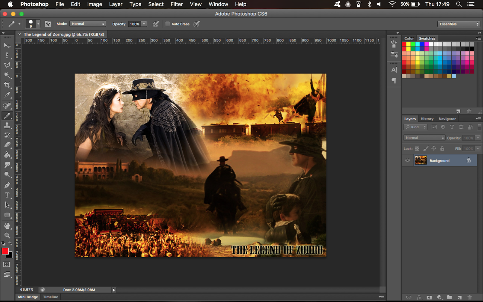
(Above: A screenshot of one of my favourite montages opened in Photoshop. Montages was one of the workshops we did on my course, which is when several images are blended and combined into one. I found this really enjoyable to do and it was a good way of improving my blending skills. Montages are also a good way of telling a story within one image. To create this I imported several images, around seven or eight and roughly arranged them on the canvas. Working on each layer individually, I created a layer mask which is the black circle in the white rectangle symbol at the bottom of the layers panel. This then puts a blank white rectangle against the layer you are working on. Ensuring this is selected, you can use your brush and opacity to blend the images together by taking parts out or adding them back in gradually)

On the left of the screenshot is the tool bar. There are many tools to discover and use in Photoshop. Here is a list of the ones I use most (from top to bottom):

Selection - Allows you to select images/ layers
Marquee - Draws various shapes allowing you to make selections
Lasso - This allows you to draw around a certain shape and cut it out
Magic Wand/ Quick Selection - This selects large areas, for example quick selection would be a good way of removing a large, smooth area of similar colours such as a sky
Crop - Allows you to select a certain part of an image
Eye Dropper - Allows you pick a specific colour value
Brush - Allows you to paint/ draw on top of an image
Clone Stamp - Allows you to select a part of the photo and paste it over another nearby part to blend it. This is a good way of disguising imperfections or fixing up old and damaged photographs
Eraser - Allows you to rub out parts of the image
Gradient/ Bucket Fill - Allows you to blend one selection from one colour into another. The bucket fill fills and entire selection where the pixels are all of the same colour
Blur/ Smudge - I sometimes use this to blend rough edges or to give an image a dreamy/ magical look to it
Pen Tool - This allows you to draw curved and specific lines from one path to another. I've only recently got used to this tool in Adobe Illustrator
Type - Allows you to add and edit text on top of your image
Shape - Allows you to draw shapes

Colours - On my screenshot, red is the foreground colour and black is the background colour. This means that currently red is my main 'fill' colour and black will be the colour of any outlines, known as the 'stroke'.

Below this is a symbol of a circle within a rectangle. This is called "Quick Mask Mode". When using the quick selection tool, it can sometimes be very fiddly trying to select which parts of the image you want to select and the bits you don't. By clicking this it highlights the parts in a colour which you can change at any time. This allows you to zoom far into the image and use the paintbrush to select every single little detail.


There are also many tools and options across the top of the screen. In adjustments you can alter the vibrance, contrast, brightness, exposure etc. Filters can also be added and the levels changed to give an image more punch. For anyone new to Photoshop or confident users, these are worth experimenting with.


You can also choose which windows you want open in the panel to the right. As a beginner on my course at the time, my tutor advised us to have open: layers, history and navigation as the main three. However it will depend on the project you are working on. Swatches is often needed when working with colours. Some high end projects may require having many windows open all at once. This is why some graphic designers will work between two monitors. I usually export PSD files as JPEGS, but again this may vary on the project.

Using Illustrator:

A lot of the tools in Adobe Illustrator are similar to in Photoshop, but you can do so much more when it comes to manipulation. Personally I find it a lot more difficult than Photoshop, but the vector graphics are so smooth and beautiful to work with.


(Above: Sleeping Cat Tutorial)

During my college tutor's Adobe Illustrator Course, she encouraged us all to practice various tutorials online whenever we got the chance. This gave us all the chance to get used to working with vector graphics.


As you can see from the tutorial link above, to say Illustrator looks a lot like Photoshop and has similar tools, the manipulation process is very different, depending on the project. It is more about the uniting and dividing of shapes rather than touching up a photograph. Different tools such as the warp tool can manipulate the shapes you create. Each shape/ line you create is known as a path. You can select, group, ungroup whichever paths you choose. For example, if you wanted to move only the plant at the bottom right of the cat tutorial, you would select all the paths that make up that plant and group them. This way you'd be able to move the plant without ruining the rest of the image.

Layering shape upon shape while slightly altering the colour gives artwork depth and an illustration effect. There is also a mesh tool where we all practiced with an Apple Tutorial:


As you can see, this takes a lot of patience and practice. Again, gradient blending skills are needed in this, it's all about the layering of colour to give the image depth and a 3D texture. From doing this tutorial, I can now see how this method would probably be used in the process of game designing. How the items would be created and go to and from various software for the next step in the process.


(Above: My Apple Mesh. Not bad for a first attempt!)

(21.3) Be able to produce digital graphics in response to a brief

3.1 design and produce digital graphics in response to a brief working within appropriate conventions and with some assistance

It turned out that we had another event on the 5th December, ‘YouthInc’s’ 2nd anniversary, another company under Derbyshire County Council. This meant I had to make last minute changes to add this information to the poster. This is why it is important to keep the original editable file until the print is final. They only wanted something simple added on so I added another black box with lowered opacity, added some text and their logo PNG.


The final image was sent off and I received feedback on a few alterations I needed to make. While the poster looks eye-catching in digital format, I was told that the text wasn’t quite bold enough on the printed out poster.

My line manager used her print knowledge to make some final alterations.


She made the title text more bold and aligned the writing to the left. She also changed the title to all white as it was a lot easier to notice from a distance.

My manager also wanted a digital copy for emailing out to people. Because of this I made two versions, one at 72dpi for the digital copy and one at 300dpi for the poster. It’s important that the resolution is suitable depending on what the image is going to be used for. This is why images from the internet often print out in poor quality, because they were designed to be used for web rather than print, as mentioned in some of my other imagery units.


(Also see Unit 35 & 36 Above)

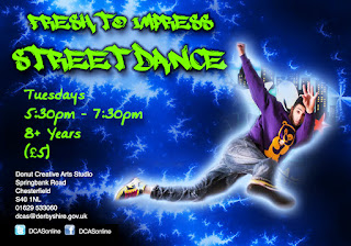
Last year I had to design a flier for the Dance Session. Please see (35.2) of unit 35 in the top link above. I used Photoshop to design an A5 sized flier for print. If the brief had been for any bigger I would have no doubt been advised to use Illustrator instead to avoid pixelation, but this was before my knowledge of the software was as good. The dance teacher knew what he wanted, so I created several designs and kept him informed at each step of the process. I had to make a lot of changes, because the colours on-screen were totally different to how they came out on print. I used a lime-green graffiti font which I downloaded, so it would appeal to young people and express the style of dance they would be learning, 'Street Dance'. I also made sure it complimented the bright colours of the background image I used. Since that job, I have learnt so much more about digital imagery and sizes etc. If I was to do this again, I would use Illustrator and double check on my sizes and resolution.


I recently found the image and checked its size. It was 1056 x 740 pixels wide, but the resolution was on 72 DPI. For print, it should have been much higher and on CMYK colour mode. By doing this apprenticeship I have learnt so much more about the importance of image sizes and quality, depending on what the image is to be used for.

More Of My Work from DCAS:


(Above: Facebook Banner session designs. When it comes to things like social media and uploading images, you will be asked to crop it to the area you want to be shown. Sometimes it's easy to move an image around until you're happy with how it will look, but it's not always the case. If you want your whole image to show, whether it's your profile picture or a cover picture, YouTube banner etc, it's important that your image is the same size as the dimensions required. This way, your entire image will be on show)


(Above: Session flier and Sticker Design Idea. Looking back, the sticker design should definitely have been done on Illustrator. Before working at DCAS, I've only ever really created digital content to be shown online. Now I've had more experience in print, I can see the vast difference in settings and how effective and important it is)

(21.4) Be able to reflect on own digital graphics work

4.1 comment on own work with some appropriate use of subject terminology

I felt happy about the composition of the poster with the text on the blue sky and the DCAS building to the side. I thought the image I chose was a good example which demonstrated the rule of thirds and had a nice large space for the text. My personal favourite thing about it is the bottom black box with the social medias on. I feel the colours look nice against the black, and the way it runs along the bottom sort of gives off a lower third effect which is used in film editing.

(Also see Unit 35 & 36 to see my Photoshop and Illustrator work. I originally had a strong knowledge of Photoshop, but by doing my apprenticeship, myself and my colleagues were put on an Illustrator Course by our tutor. I found Illustrator a lot harder to use, but we all learnt some interesting techniques and had a go at some exciting tutorials. My favourite one was the mandala workshop because I love swirling patterns and shapes. I found it really pretty and by editing one segment it repeated the pattern all the way round the circle. Since the beginning of the apprenticeship, I've improved on my digital graphics skills and gained a much stronger knowledge of Adobe Illustrator.)

As someone who has only really ever created artwork for web use, I've become a lot more aware of digital graphics for print, and how sizing and resolution makes a huge difference in the quality of the final product.